Rekett
Client //
REKETT
Role //
Conceptualization, Design and Project Management
Timeframe //
Feb 2020 - Jun 2020
Link //
Download Brand Book
Overview
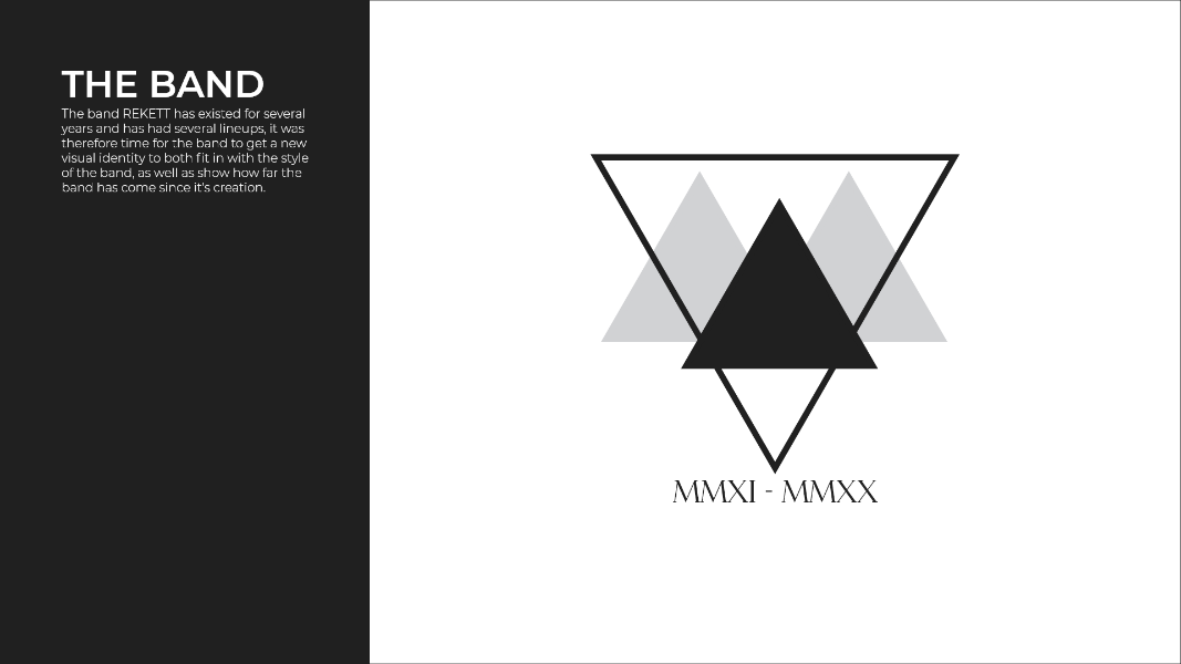
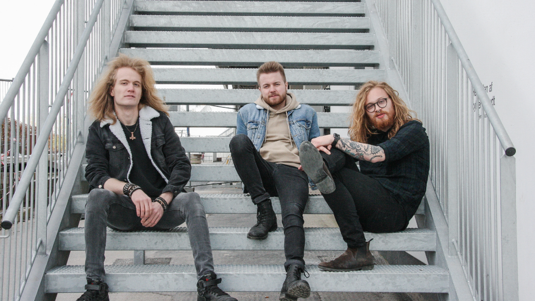
The final project during my study in Multimedia Design revolved around the client, the rock band REKETT. This involved creating digital products for the client, as the band had never had any sort of visual identity.
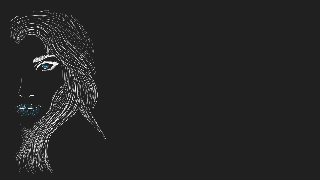
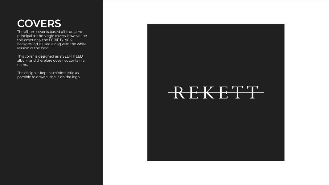
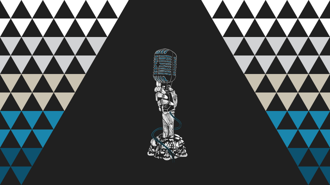
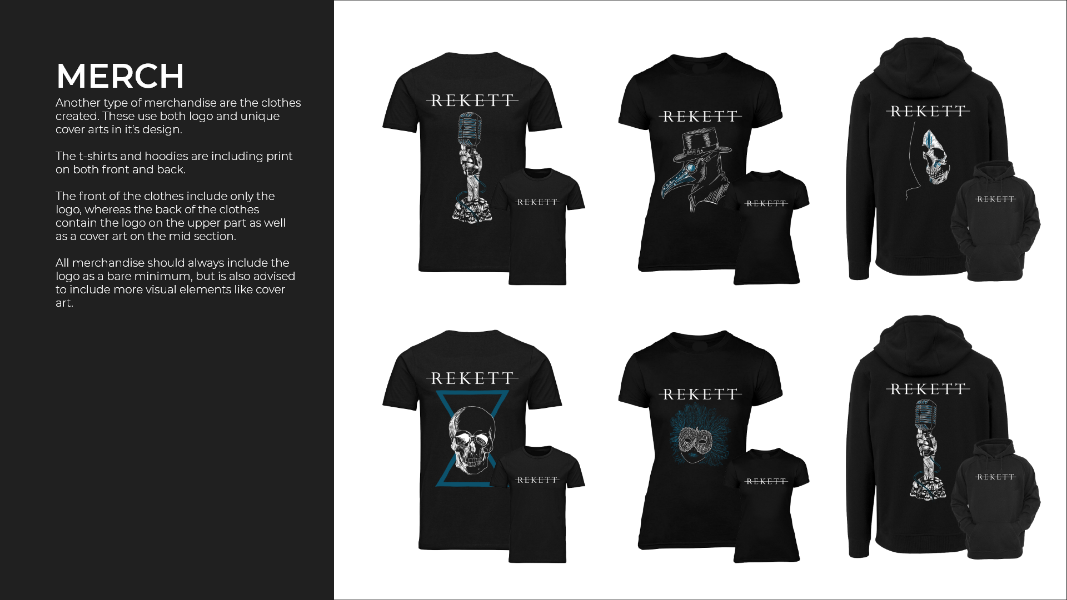
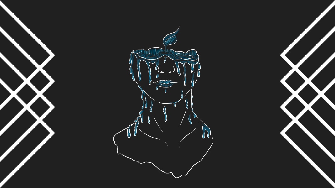
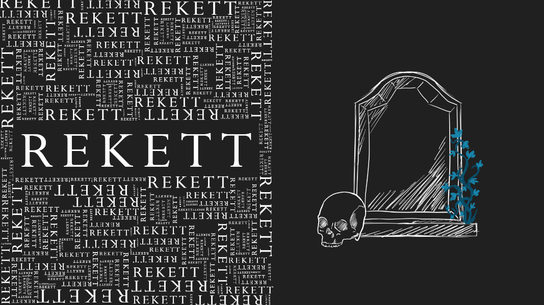
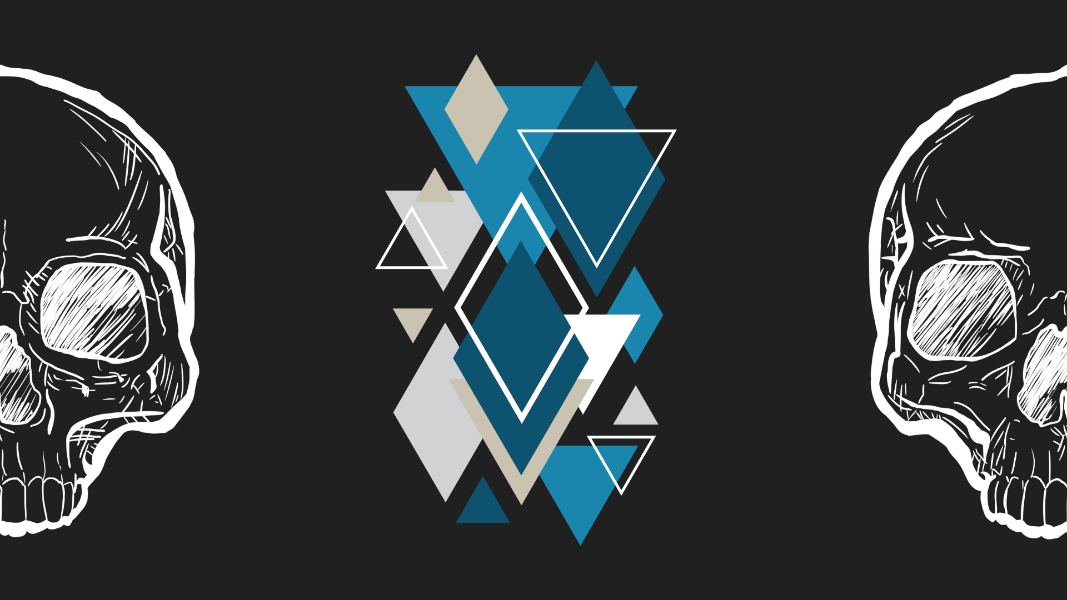
The project involved the creation of a complete visual identity for the client - including a logo, the creation of a website, design for band merchandise, mobile wallpaper design, social media presence guide, cover art and a brand book.
Problem statement:
‘How can more awareness be created about the band REKETT through various digital and physical media?’
Target groups:
- REKETT (client, primary)
- People listening to rock music (secondary)
The project was structured based on the Design Thinking framework and its five phases; Discovery, Interpretation, Ideation, Experimentation and Evolution.
Discovery
Research was conducted in the discovery phase in order to gain inspiration one possible paths to go in creating the visual identity for the client. This also included several meetings with the client in order to understand which direction they wanted their identity to go.
Interpretation
After gaining a somewhat thorough understanding of the direction of the clients needs and wants, a target group analysis was performed on the secondary target group (people who listen to rock music). This was aimed at getting a better understanding of what parameters this target group notices and finds interesting.
After this, three personas were created in order to personify the target group for which the visual identity should appeal to.
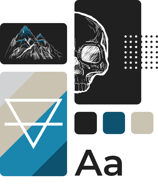
Lastly, a moodboard was created to easily visualize the direction of the project.
Ideation
The ideation phase included designing the website for the client. The web design was created with the mobile-first principle in mind. Thus were wireframes of the mobile version created first, and later turned into mockups to represent the finalized product.


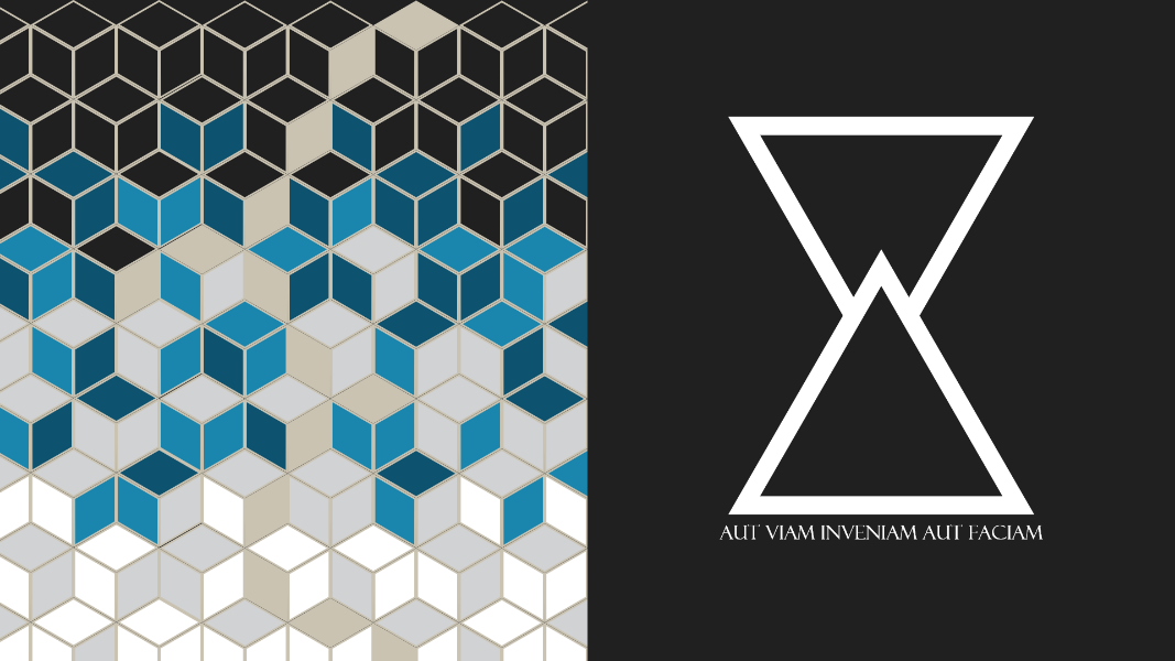
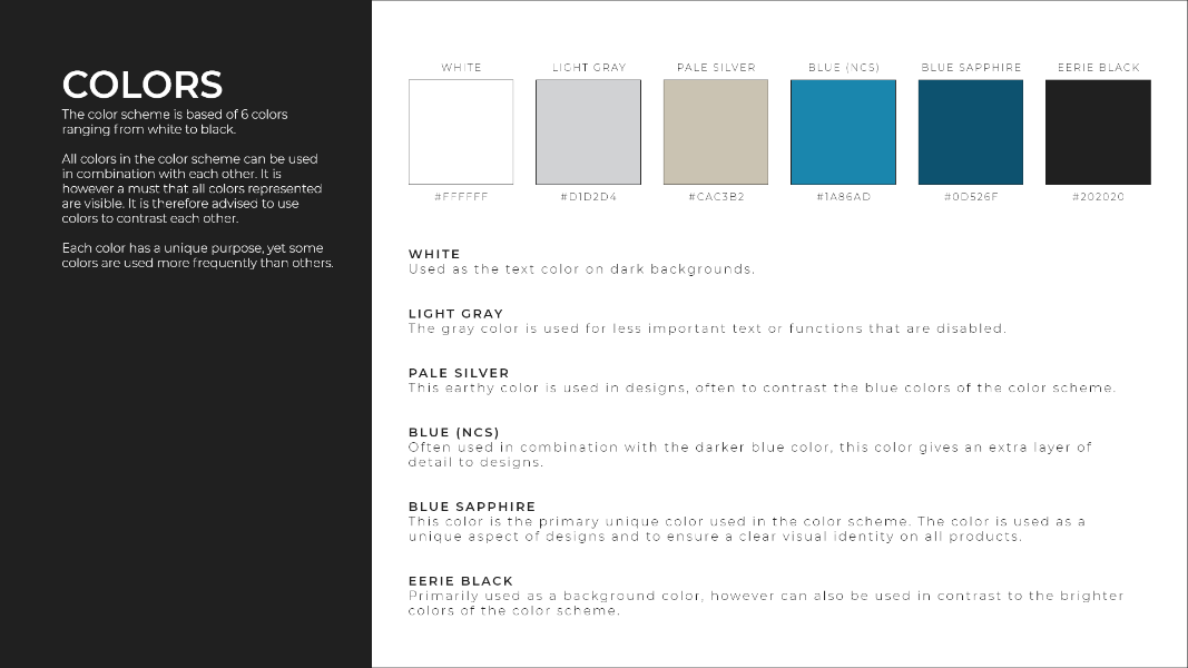
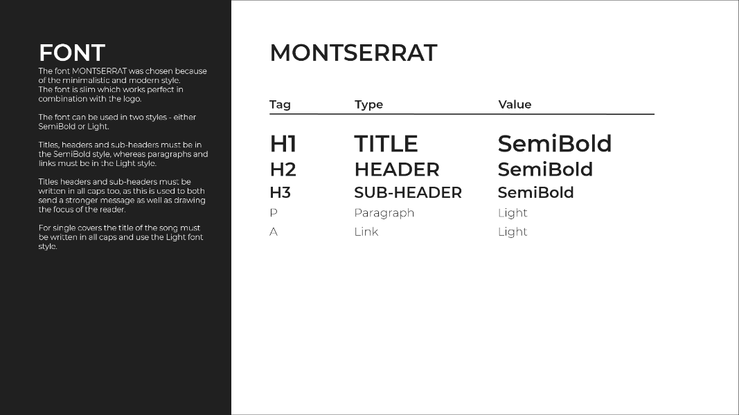
Part of this phase also included defining visual components like typeface and color scheme, which would be essential to all other products during the project.
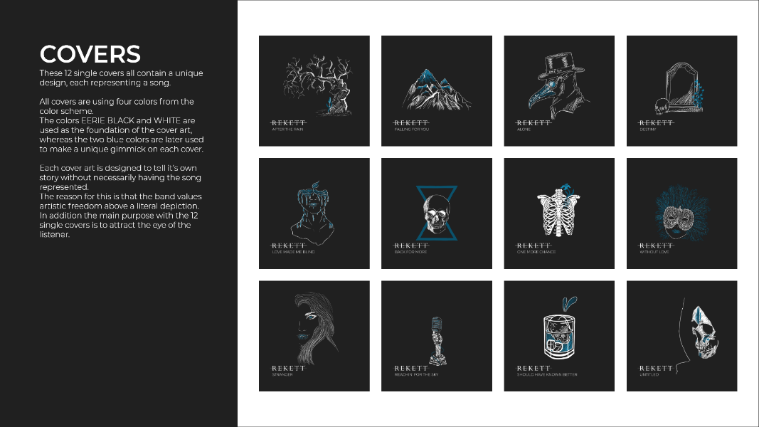
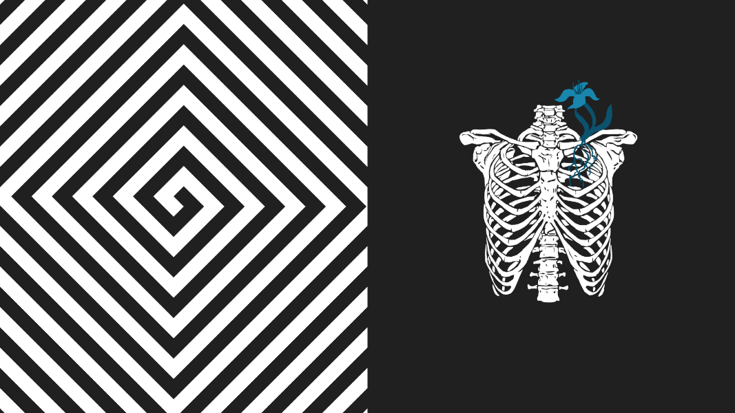
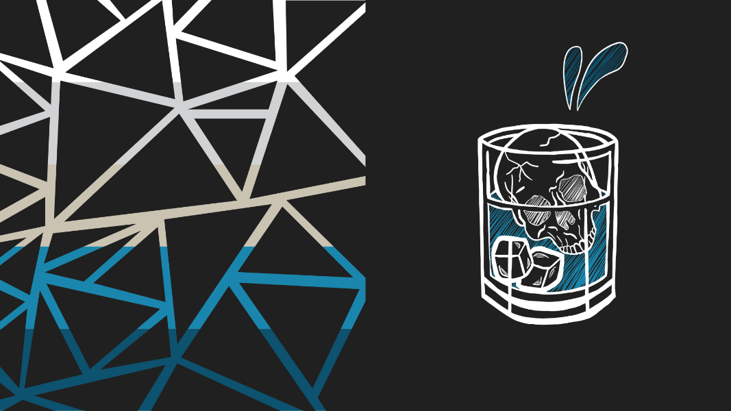
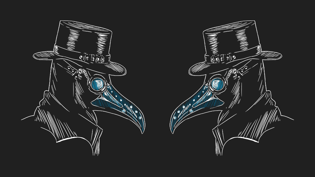
The color scheme was especially important in relation to the cover art created for the client.
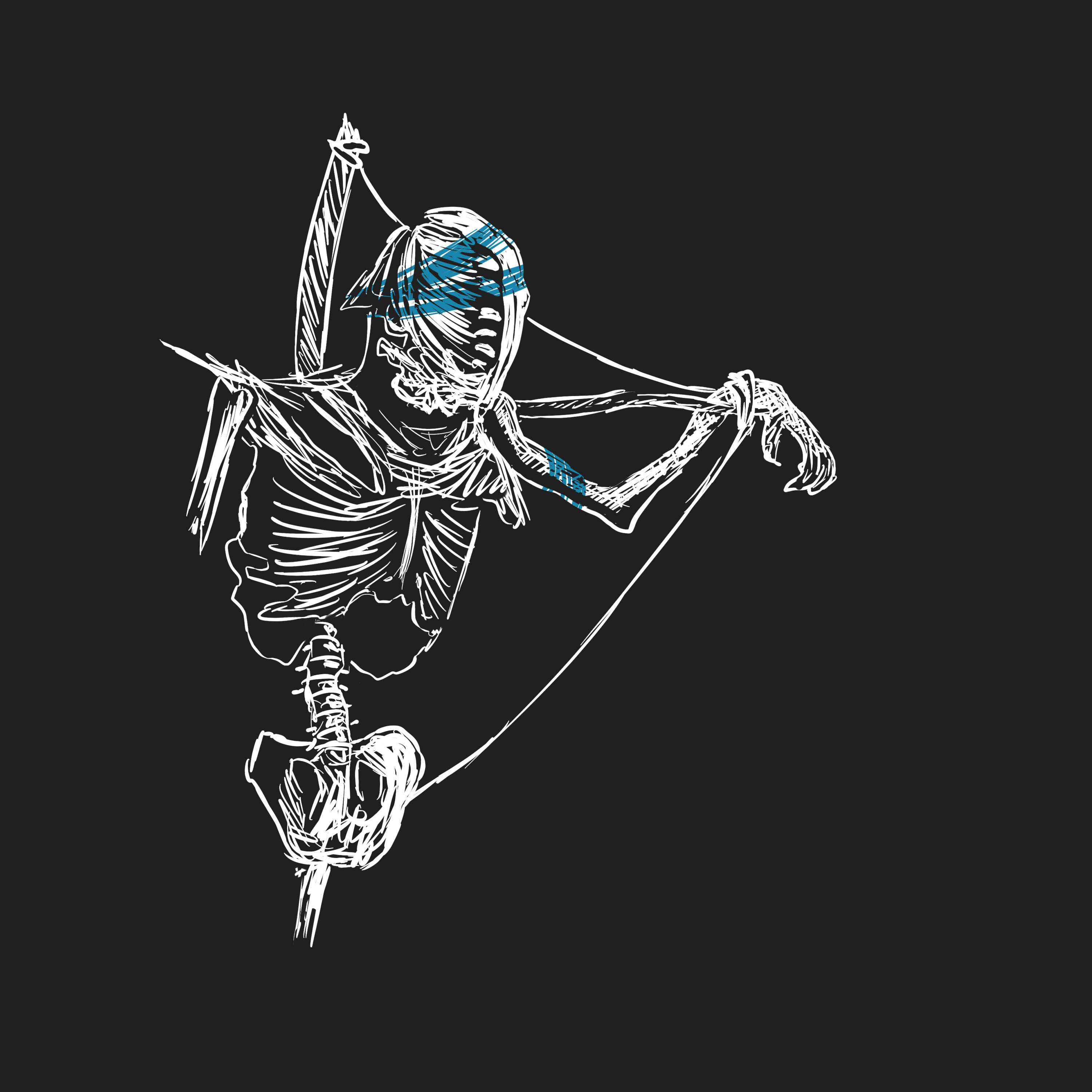
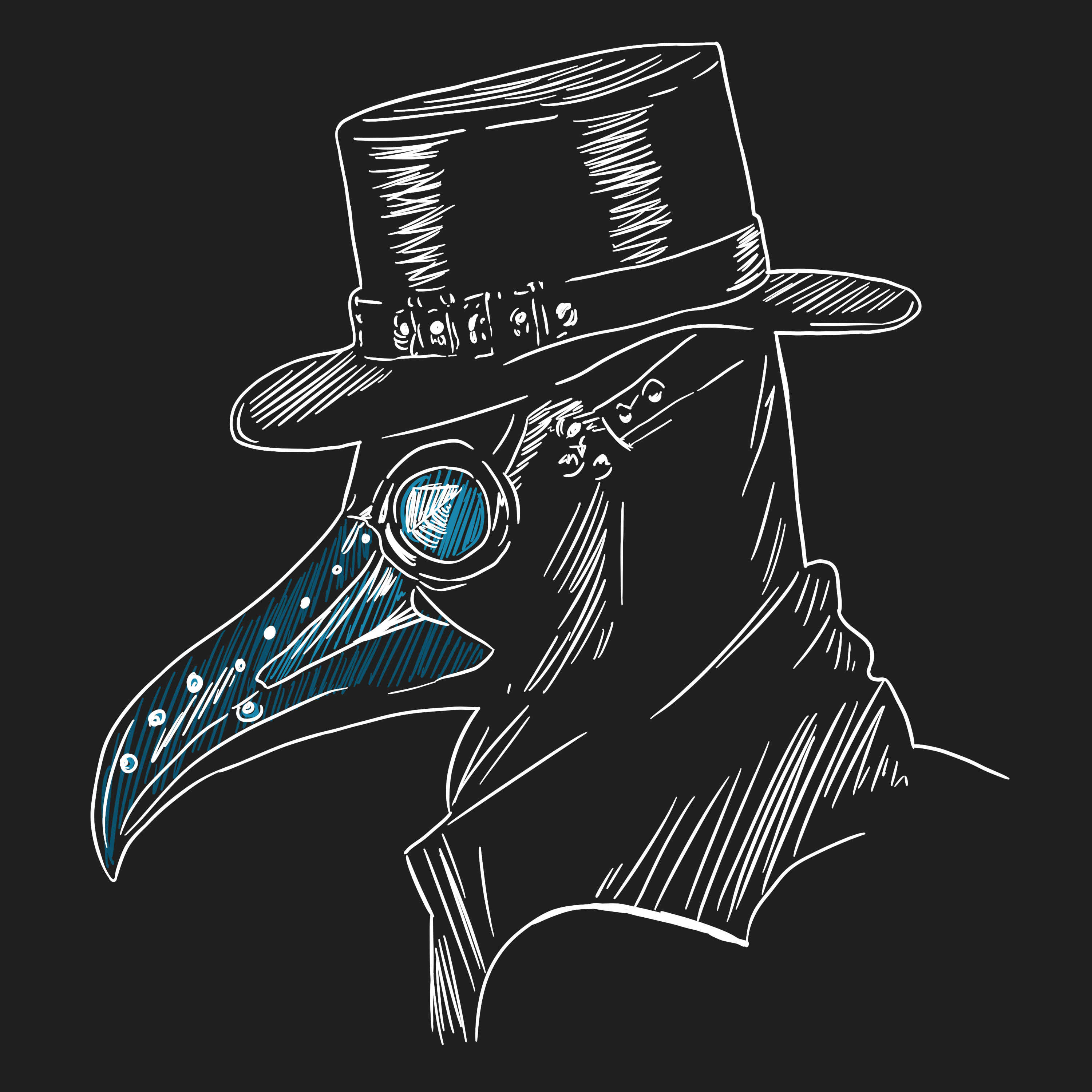
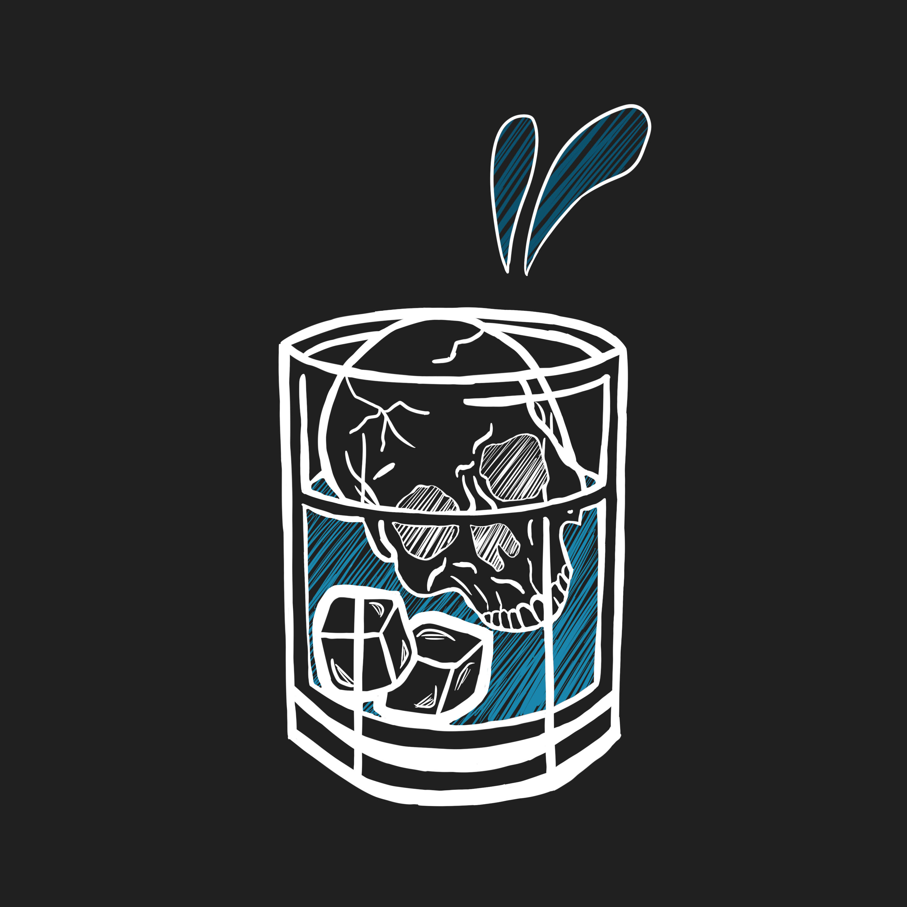
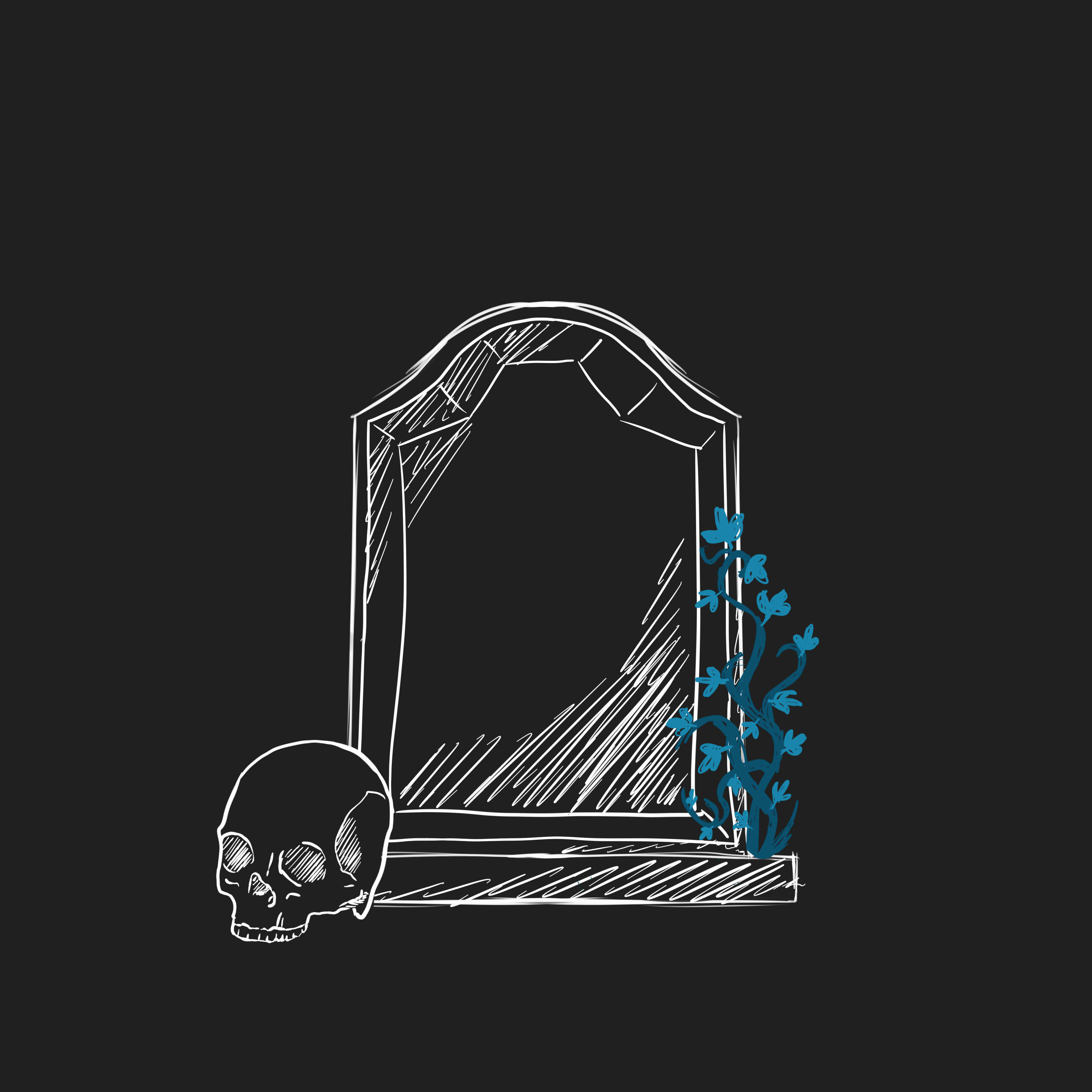
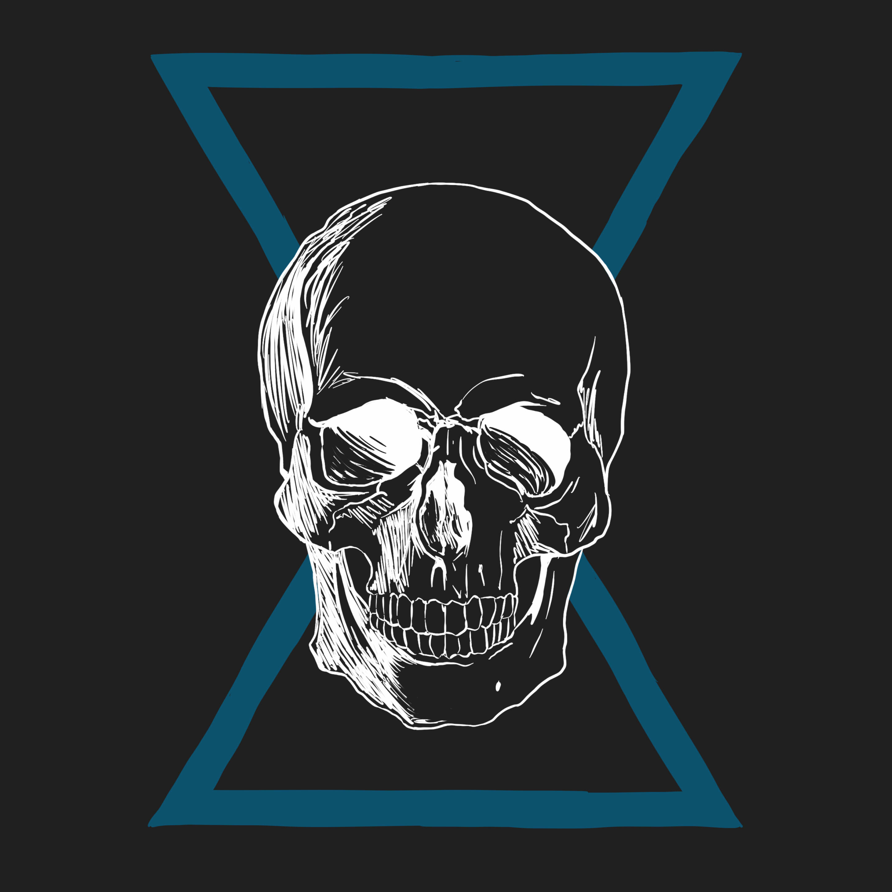
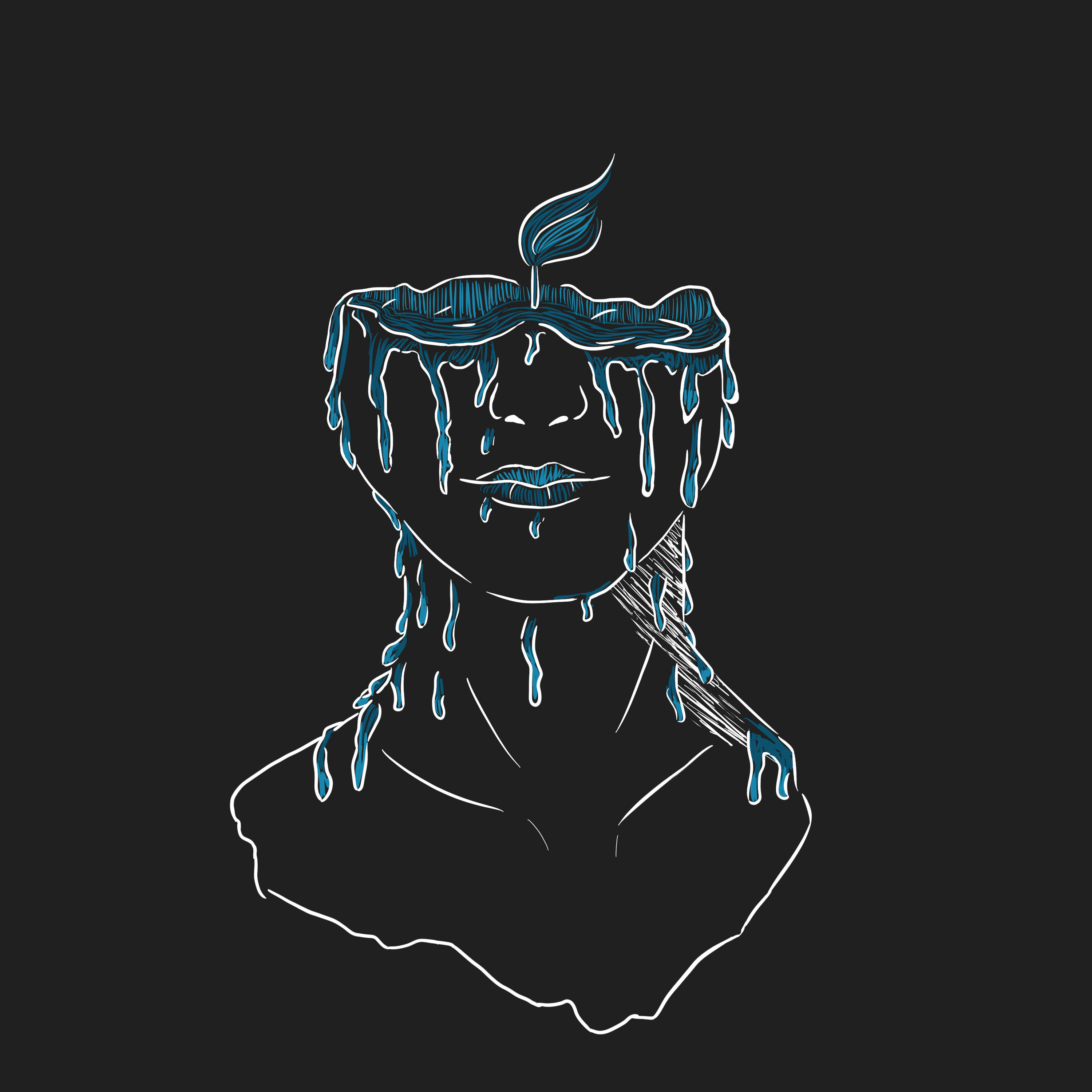
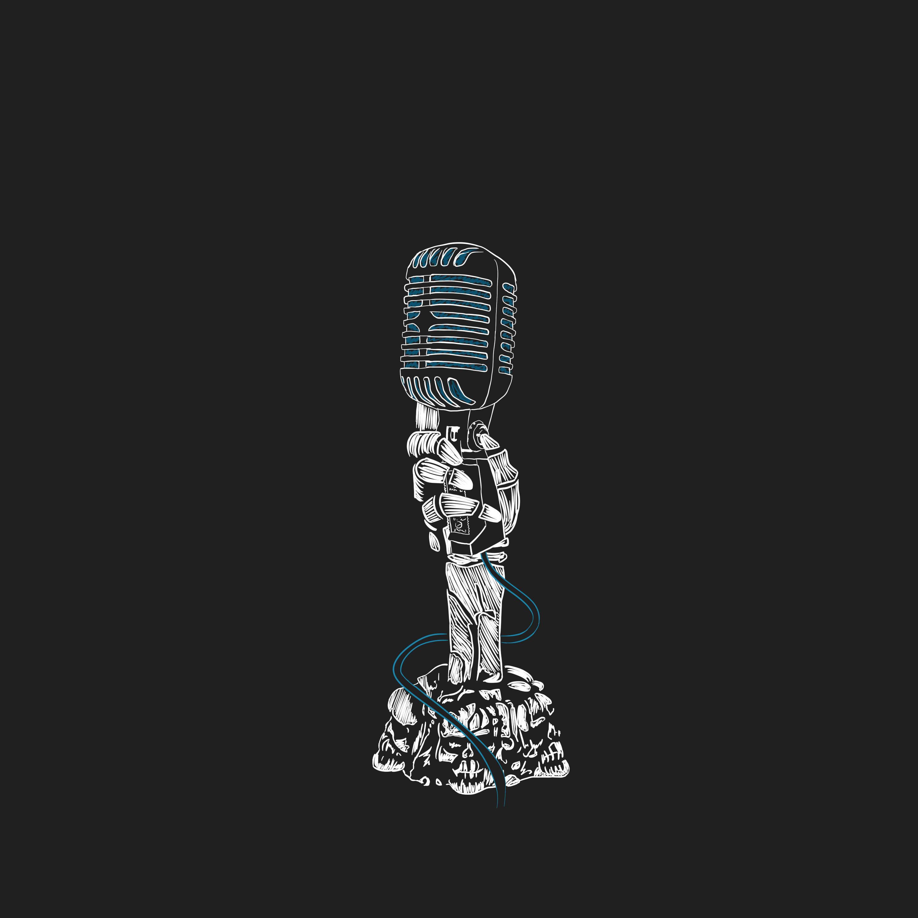
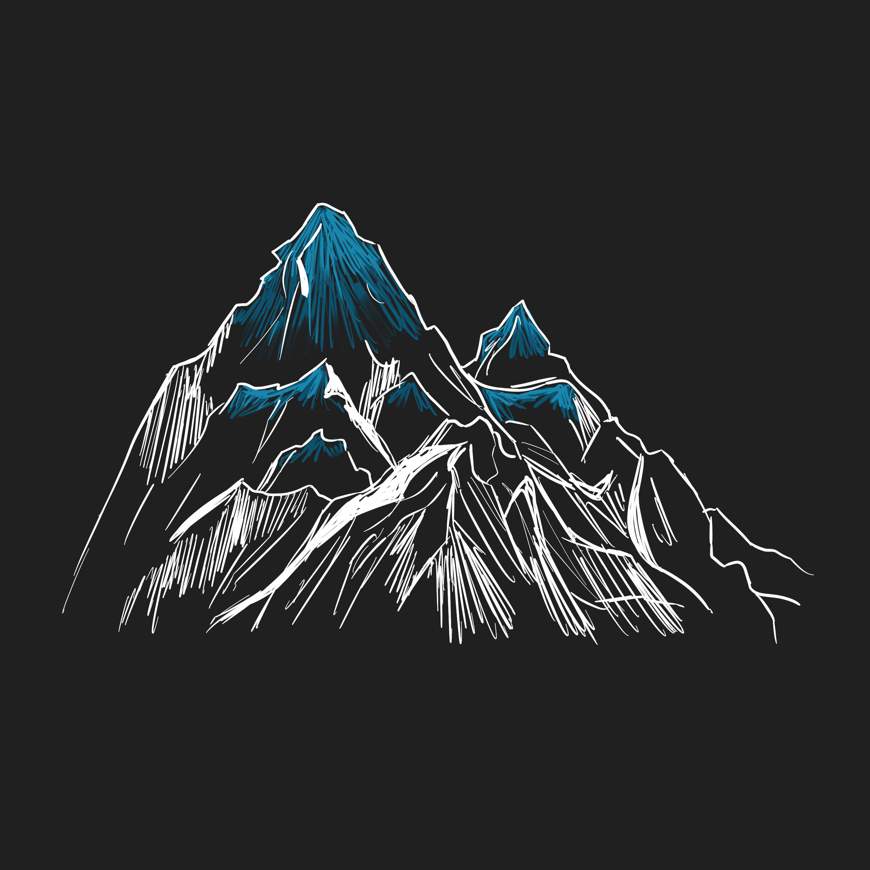
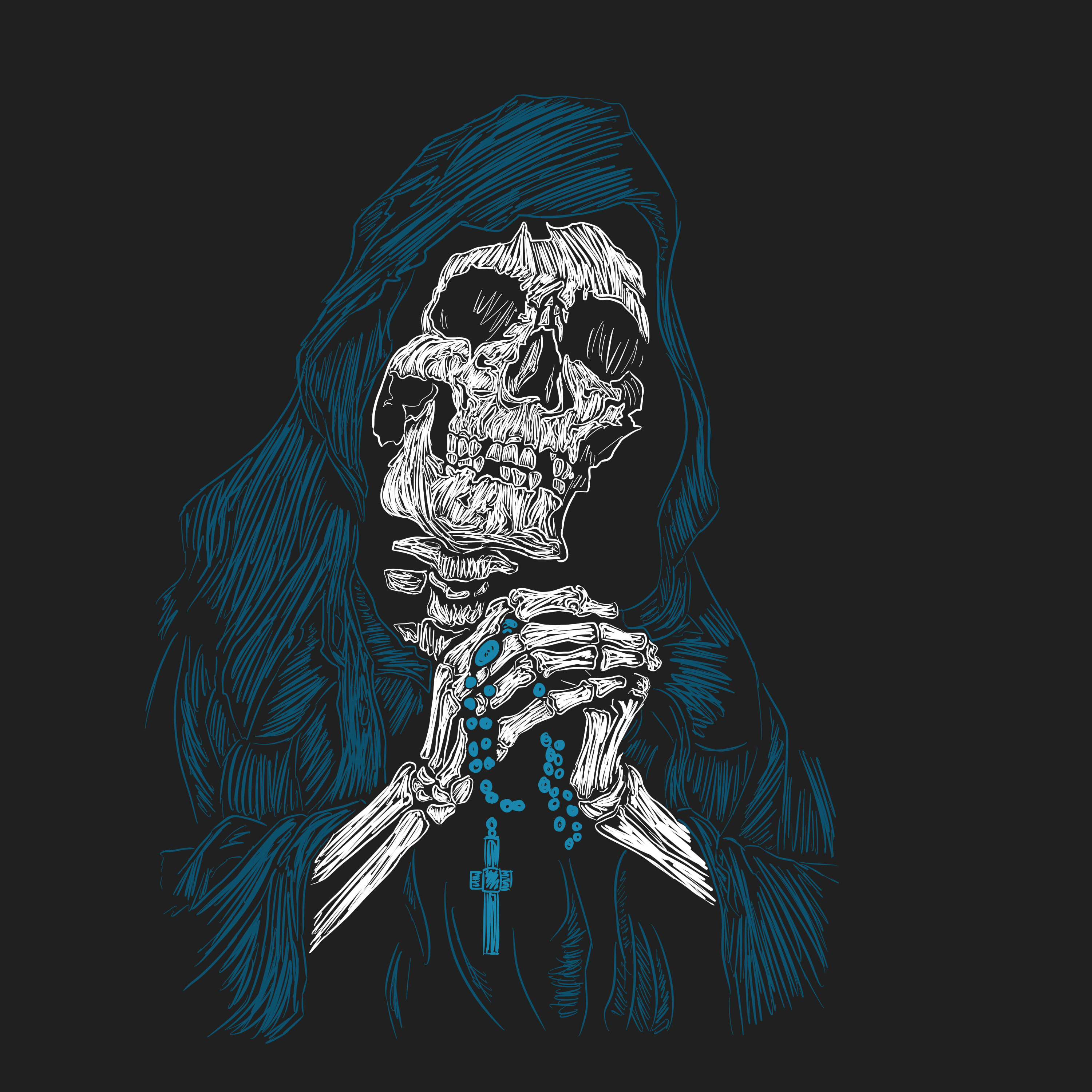
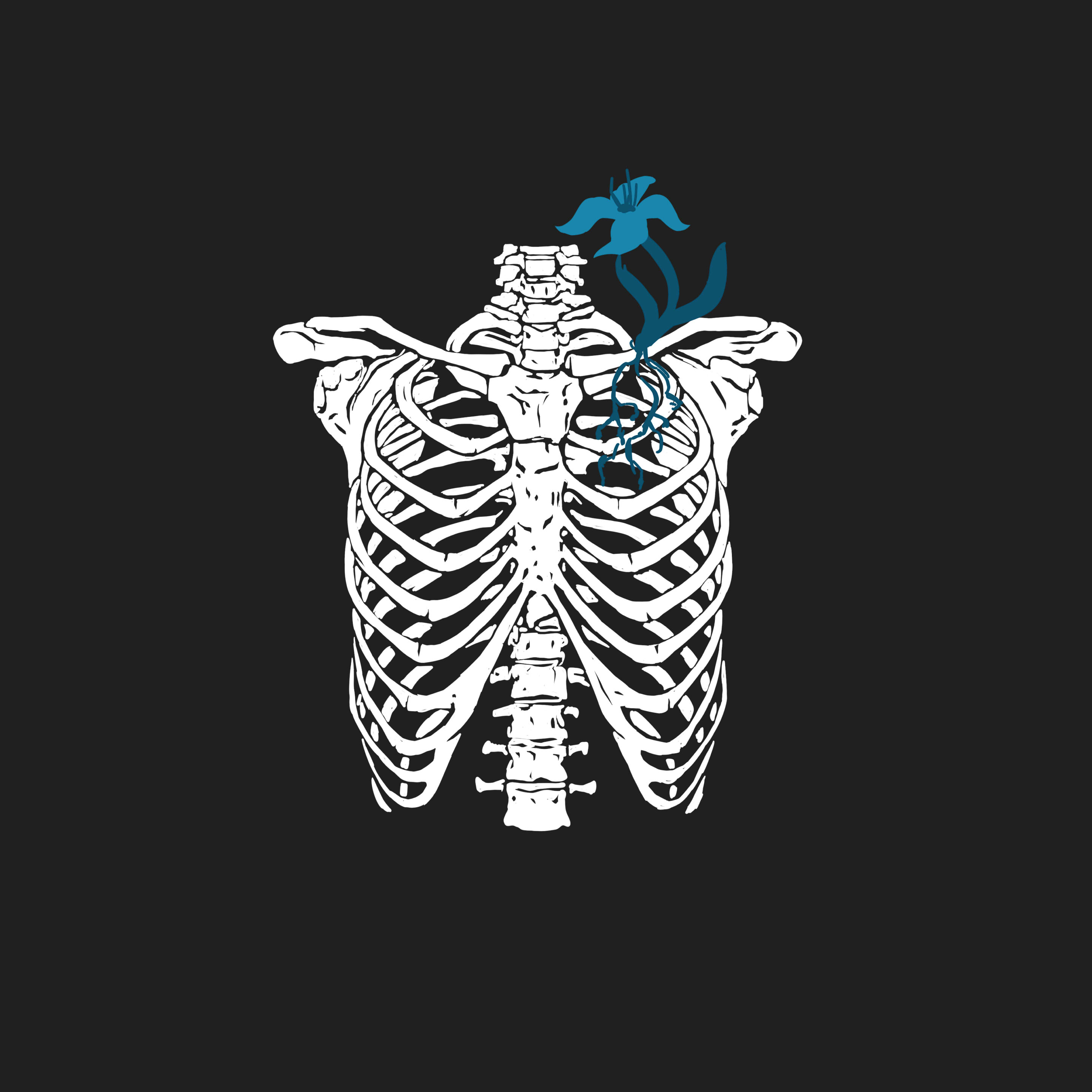
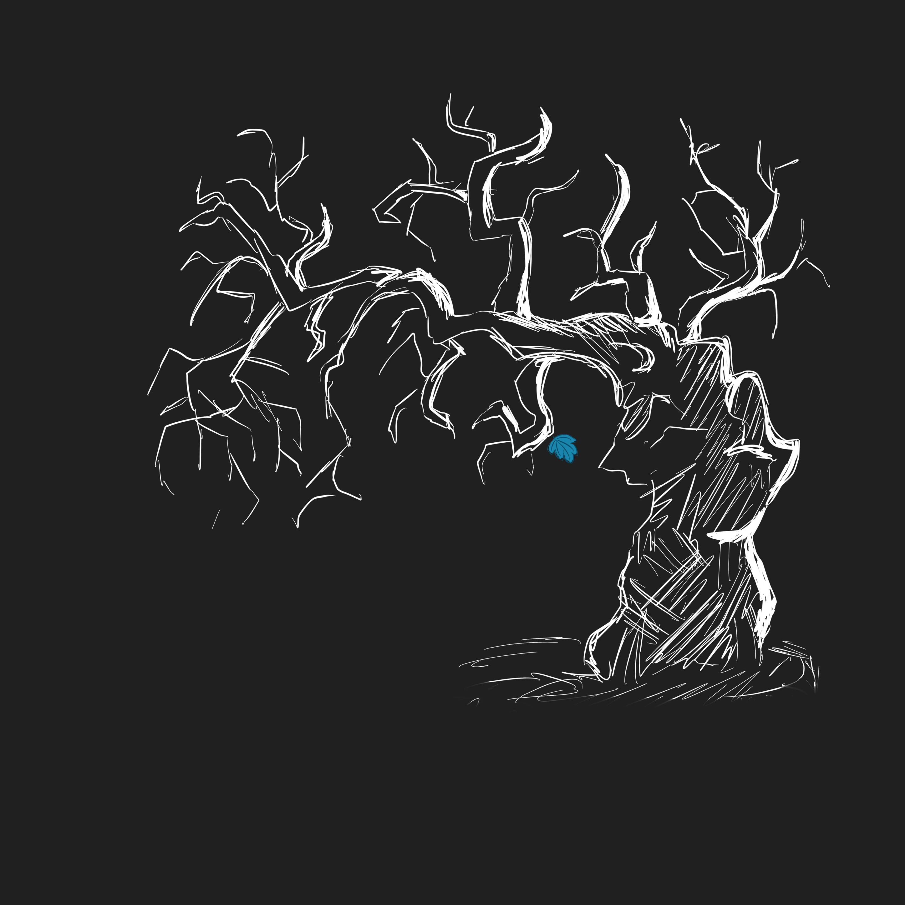
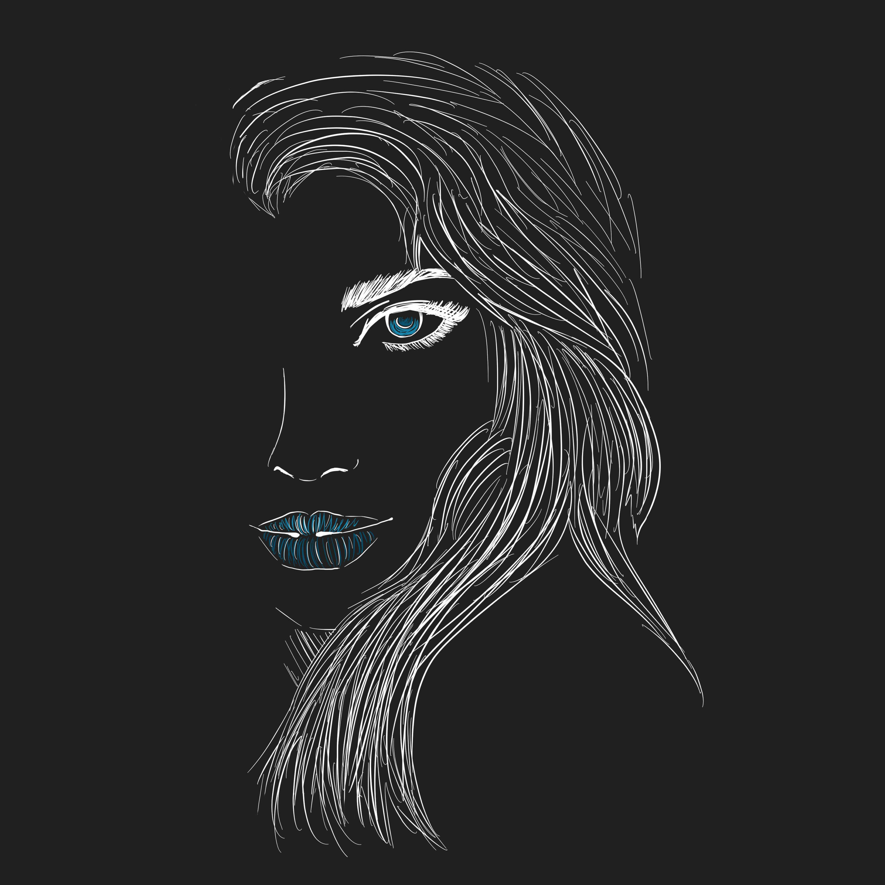
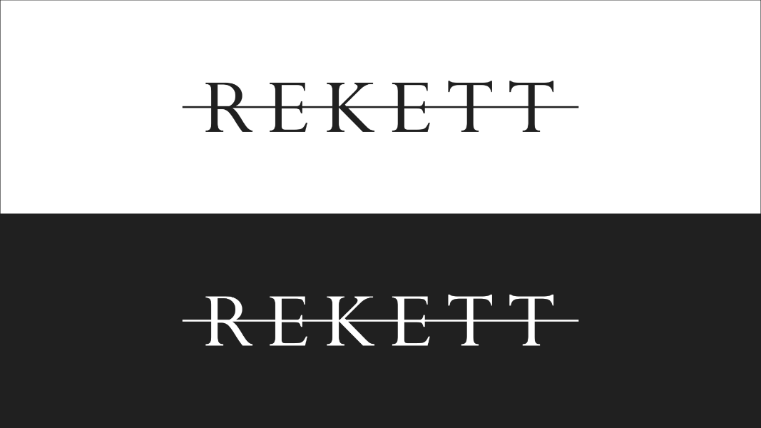
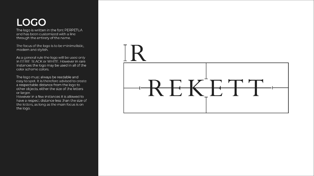
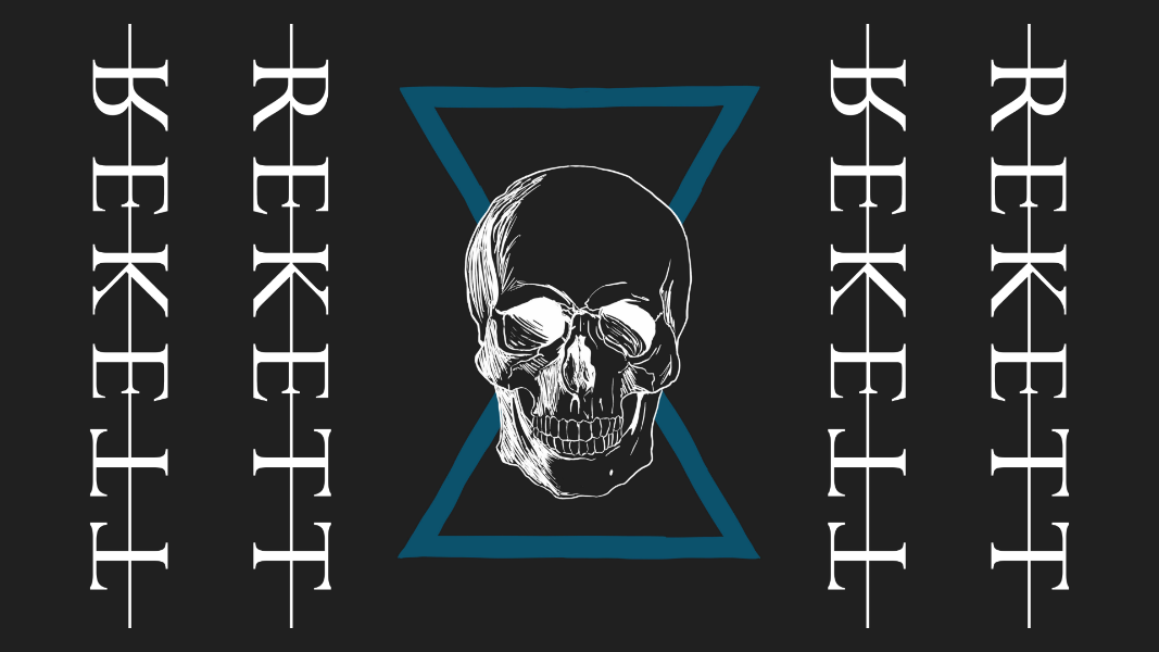
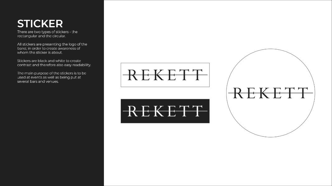
A new logo was also created for the client, to ensure cohesion between it and the new visual identity.


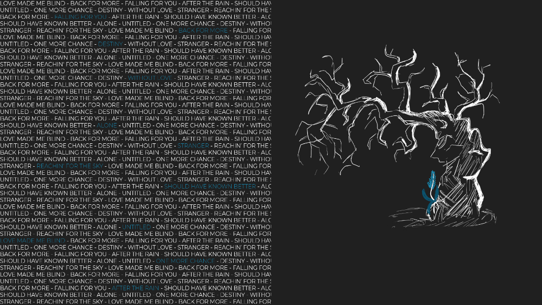
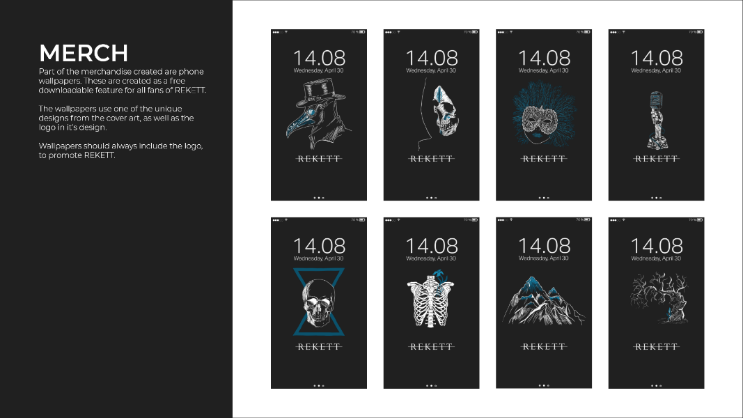
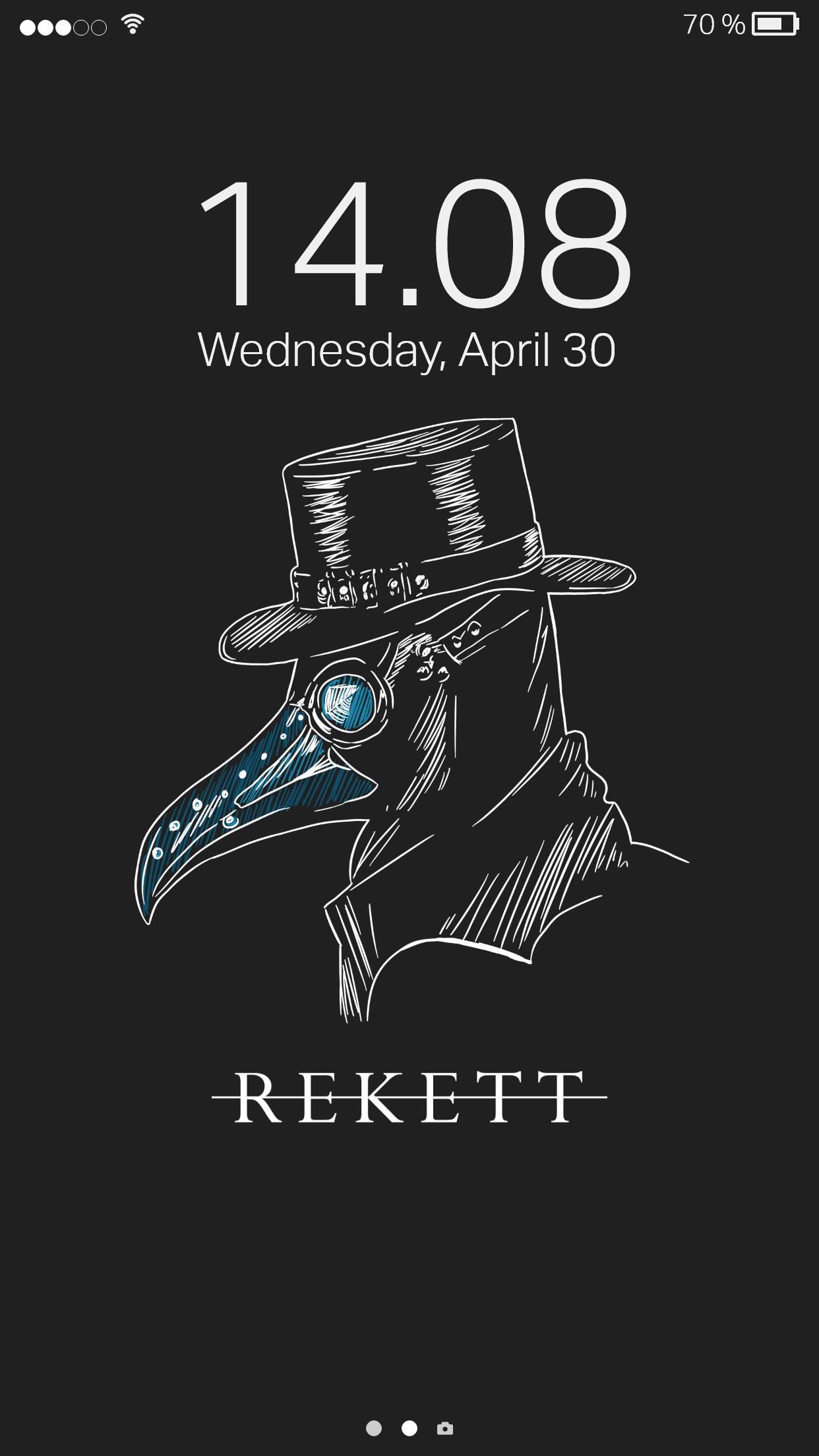
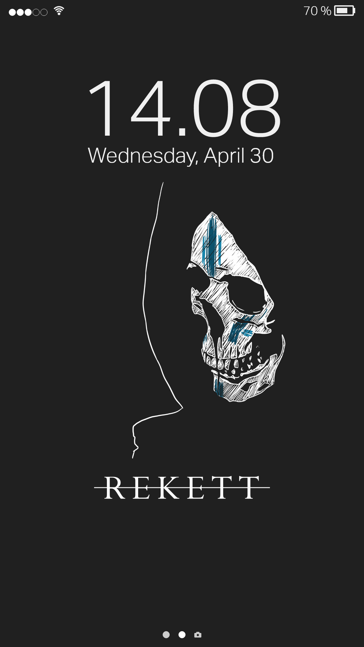
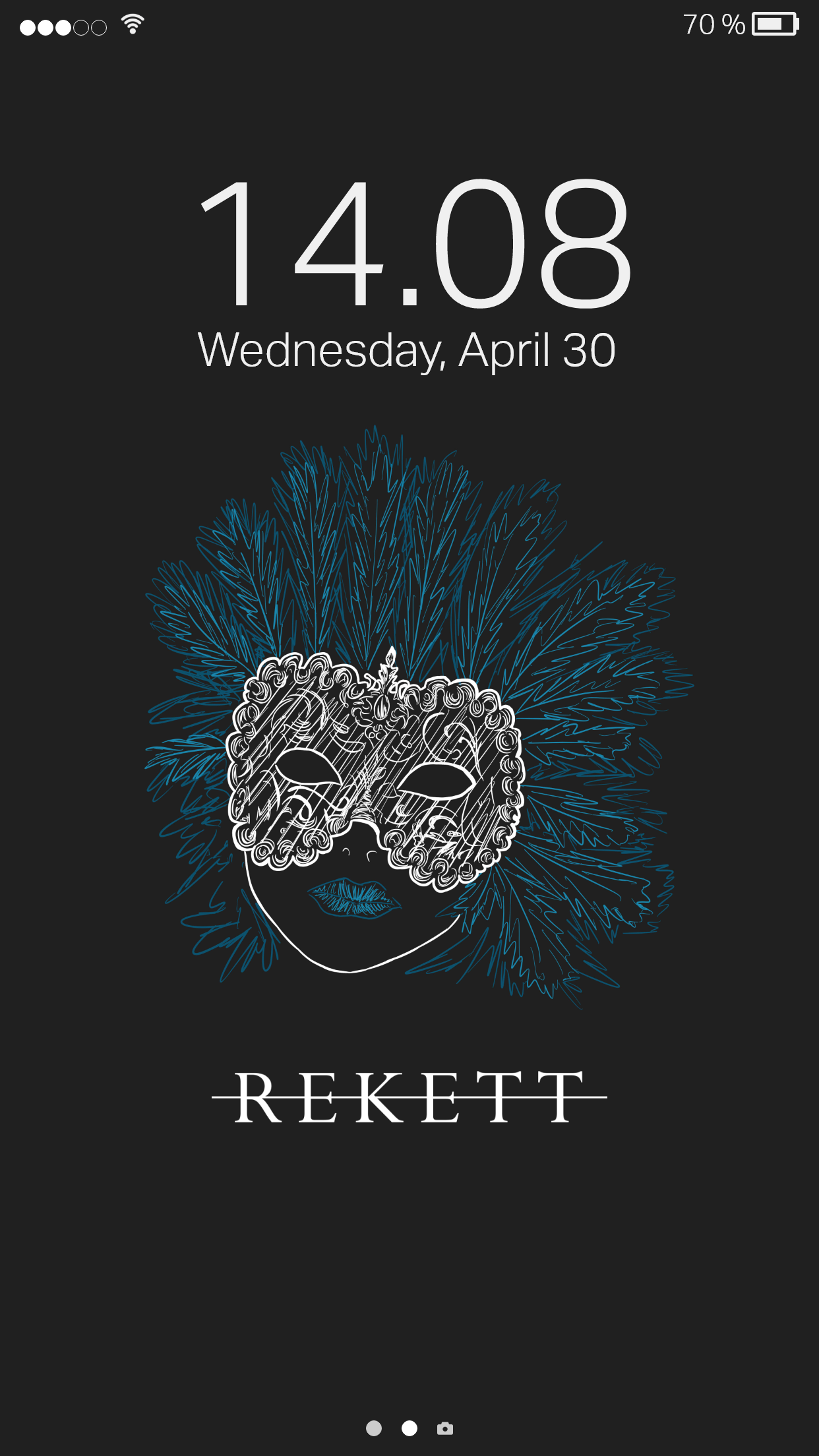
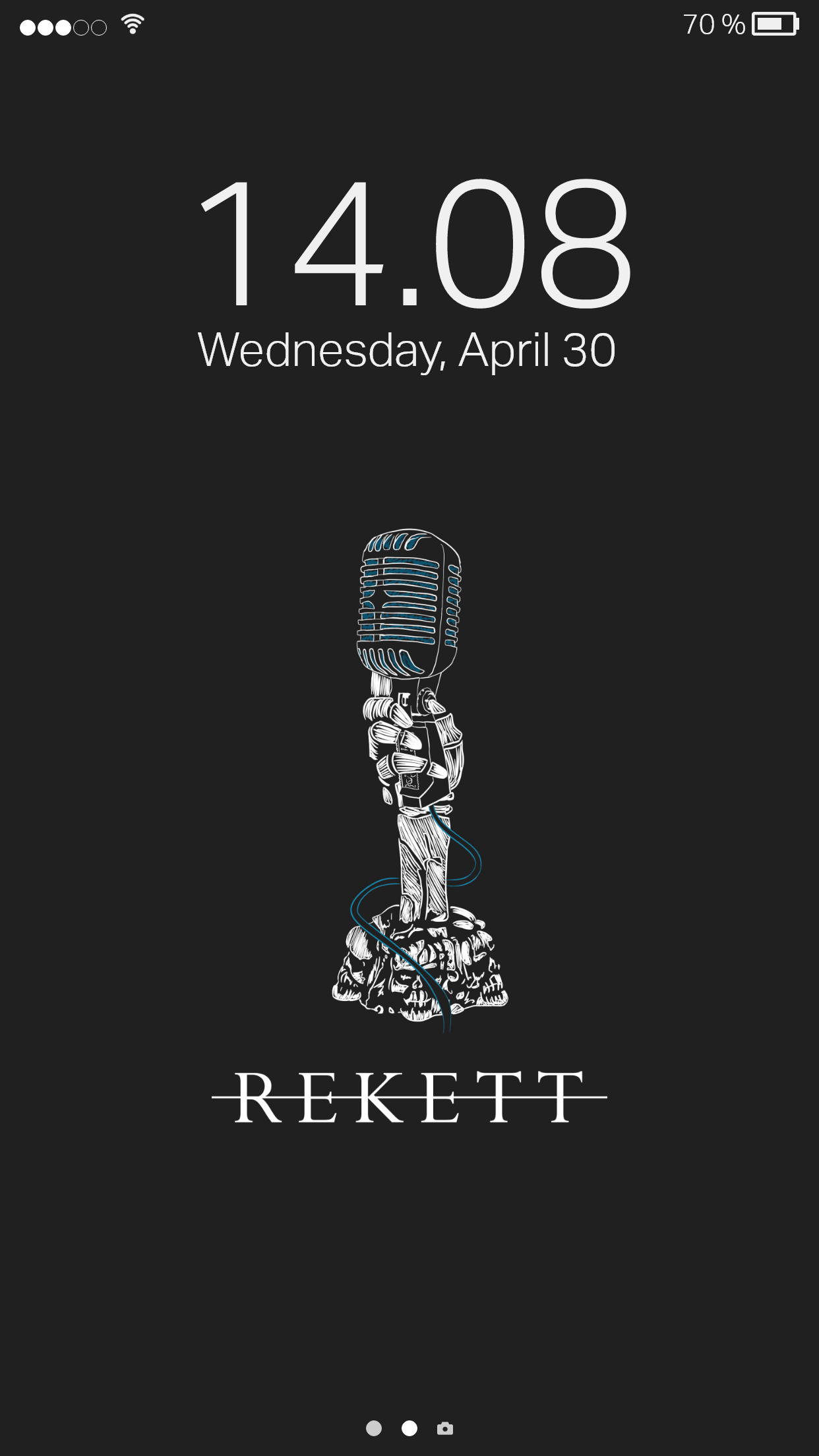
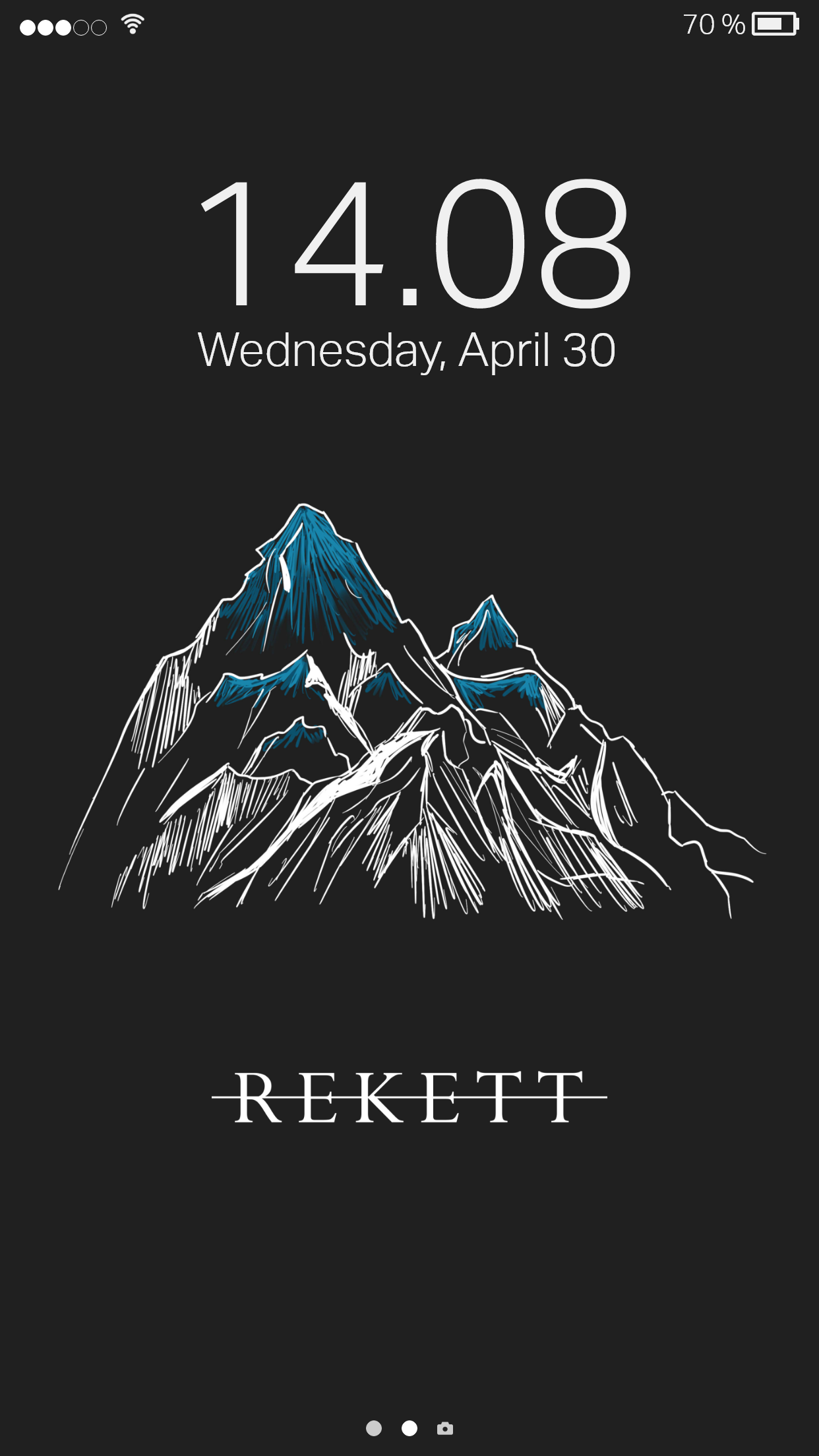
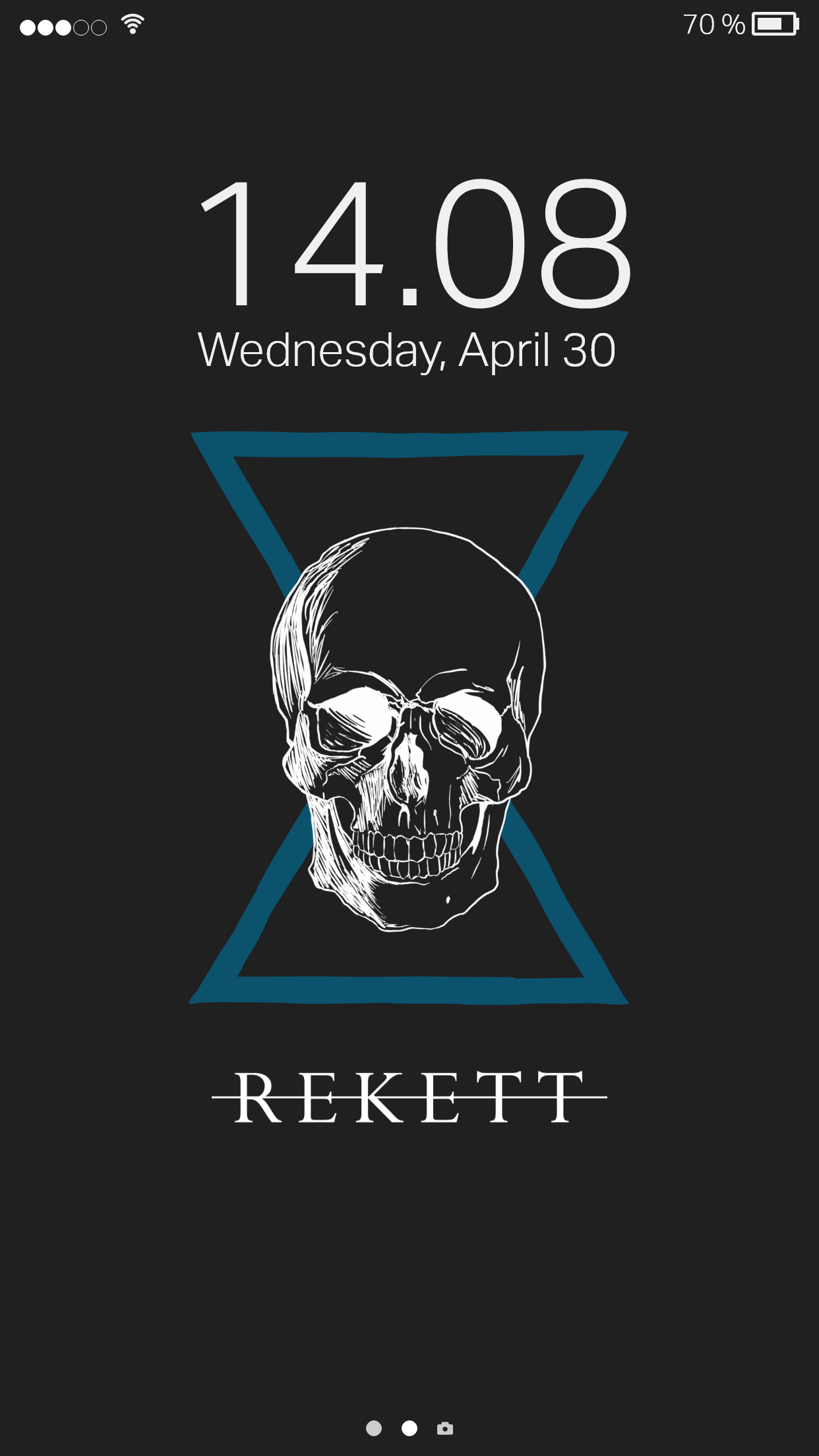
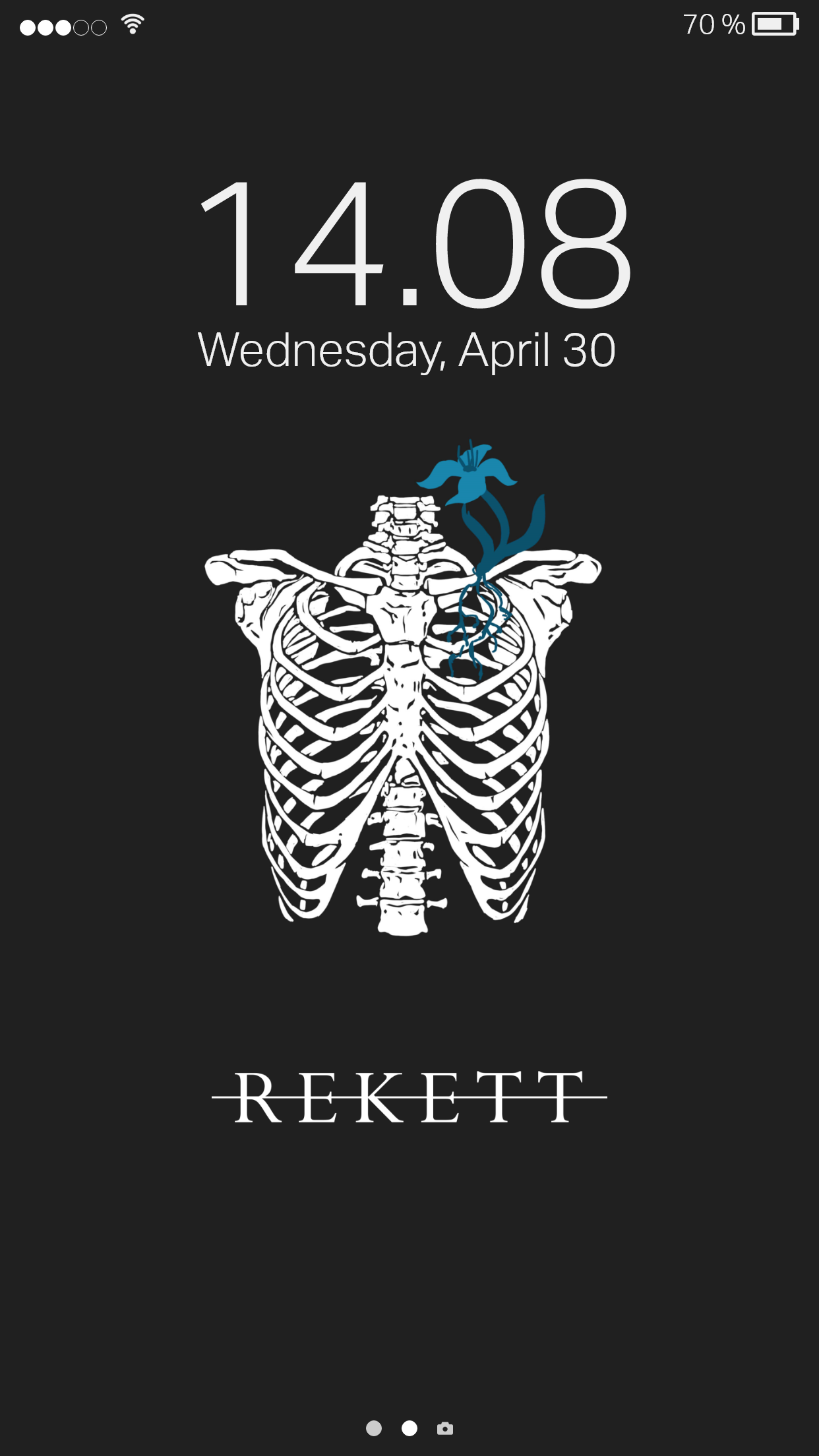
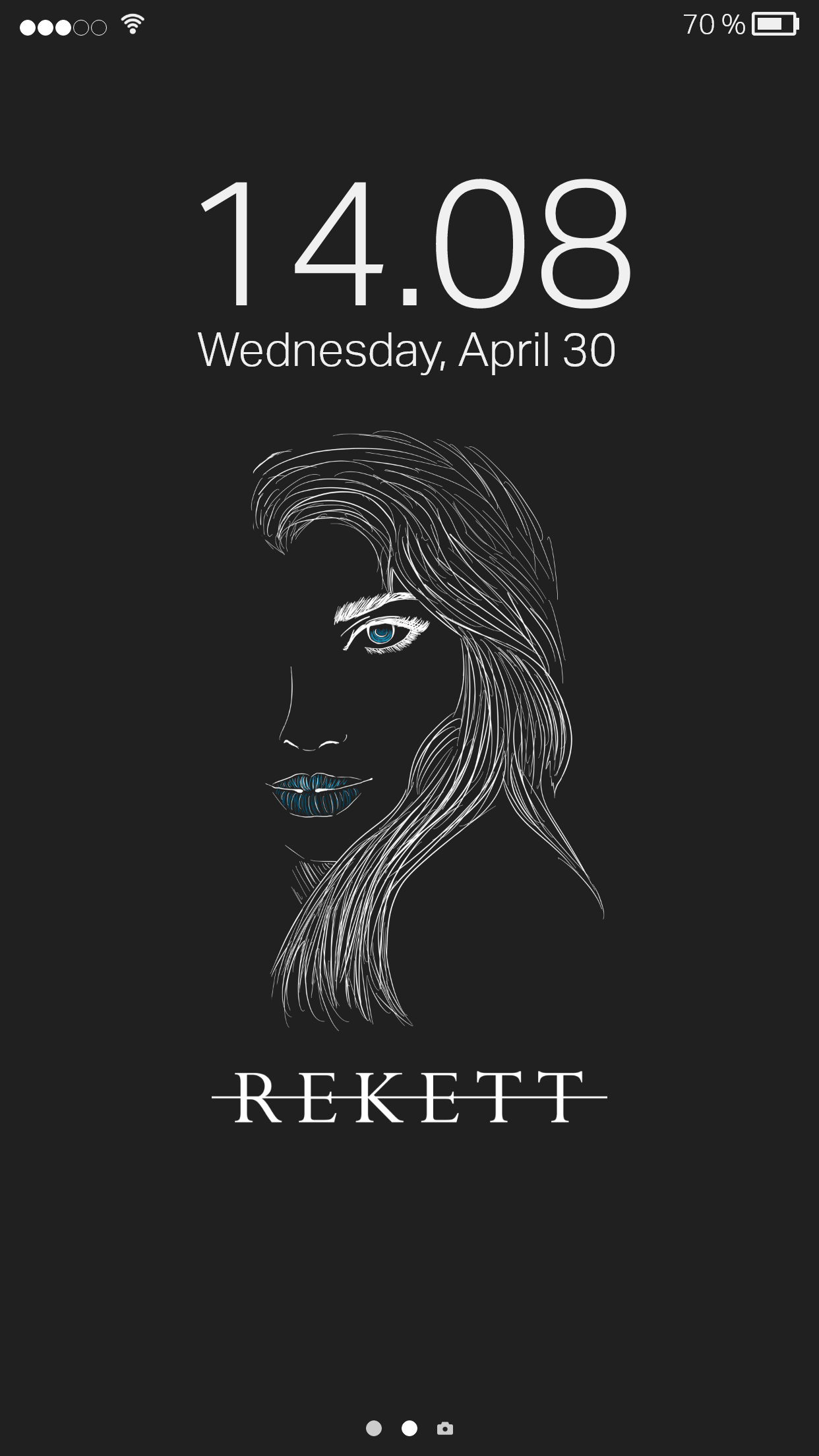
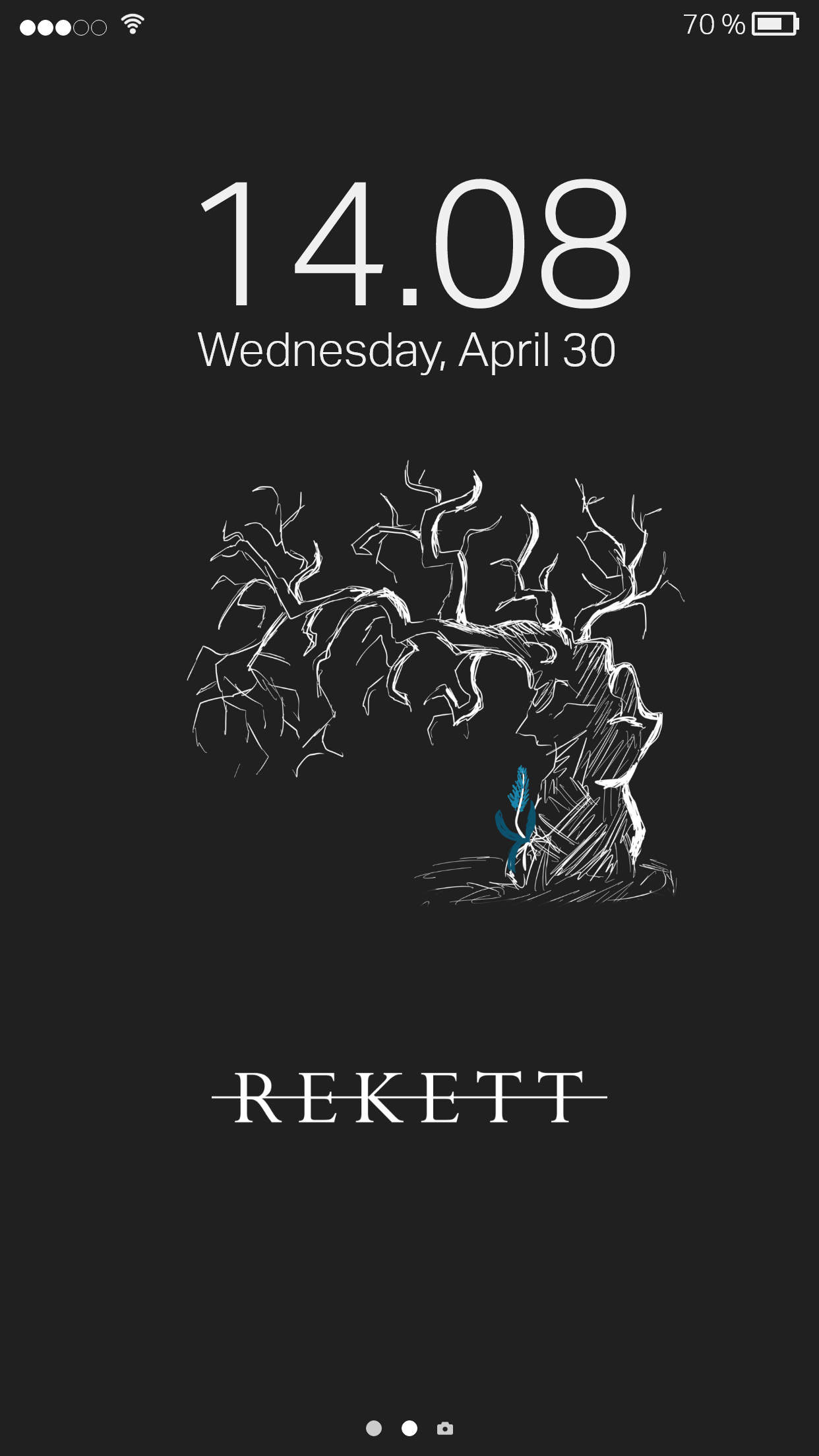
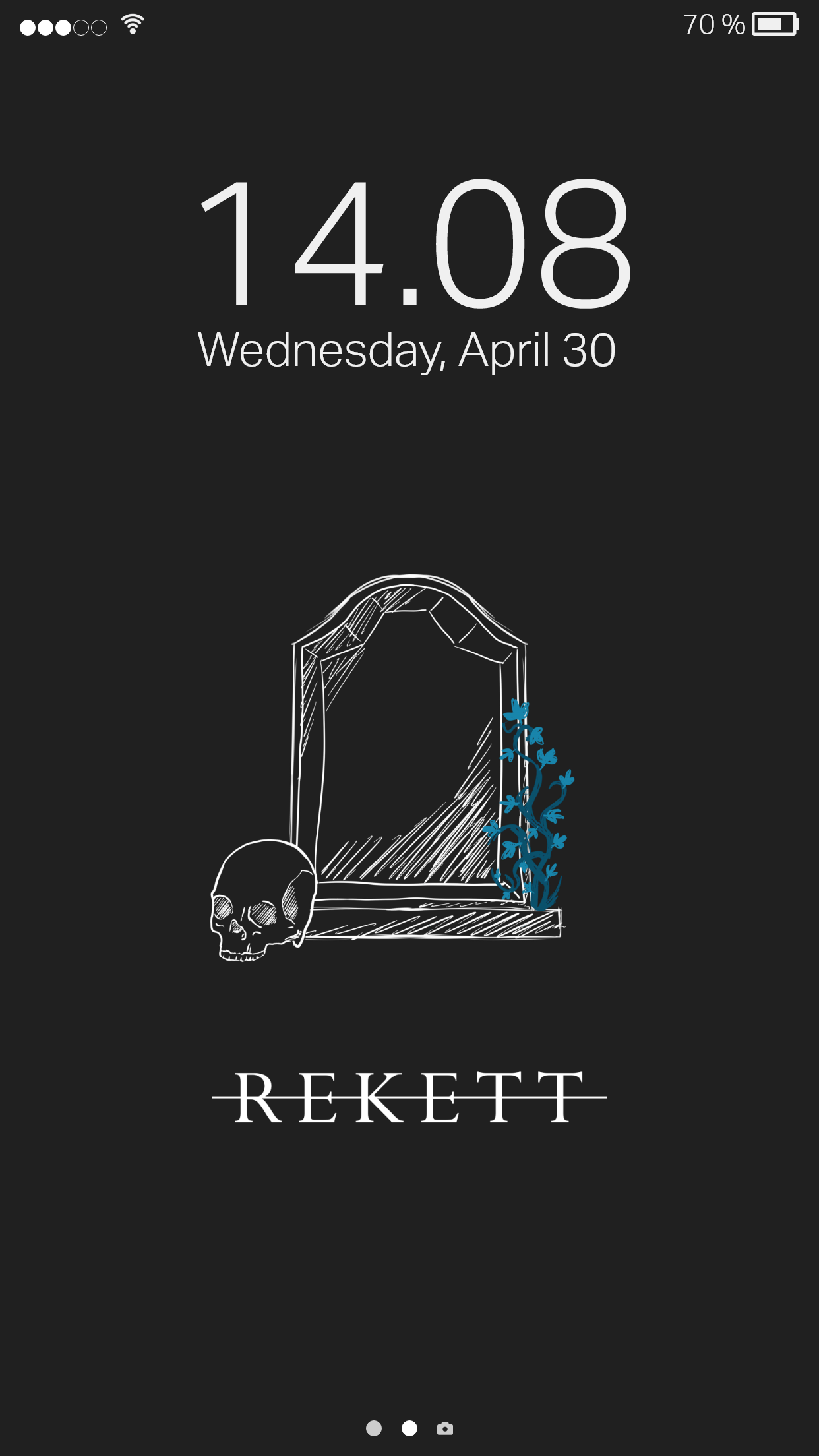
As part of the creation of merchandise like products, the idea of creating free to download mobile wallpapers came to mind, as a way of providing free and easily accessible merchandise to fans of the band.
Experimentation
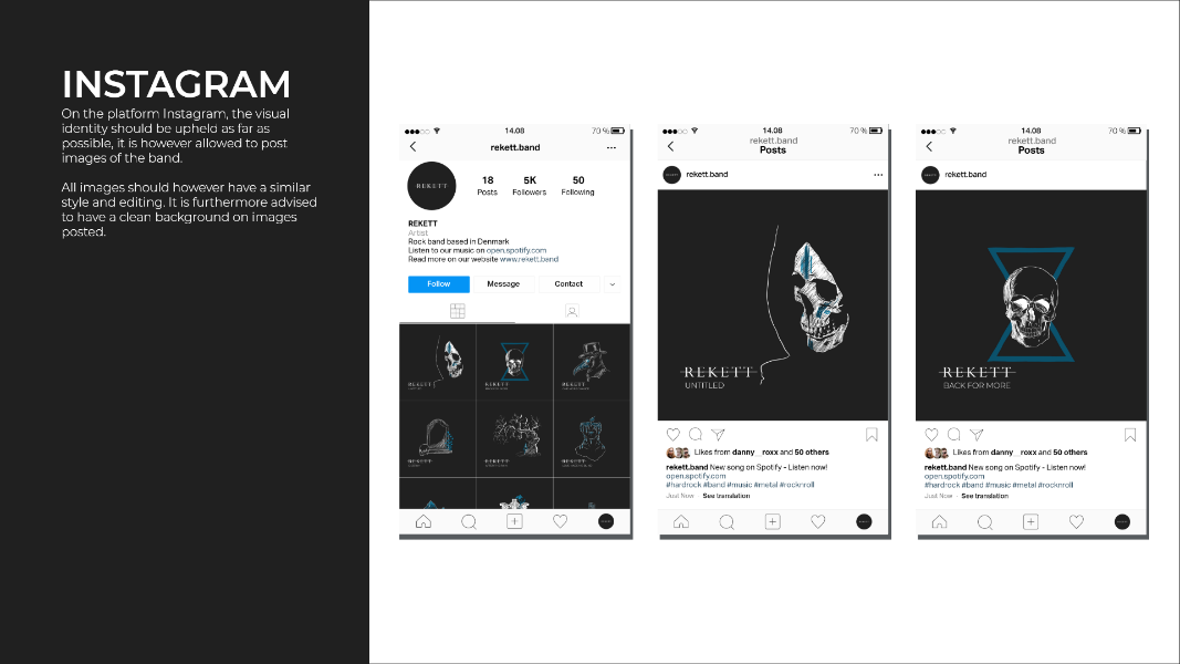
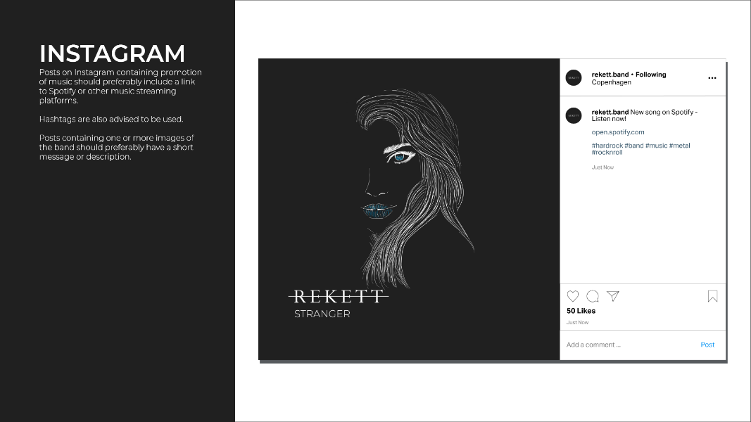
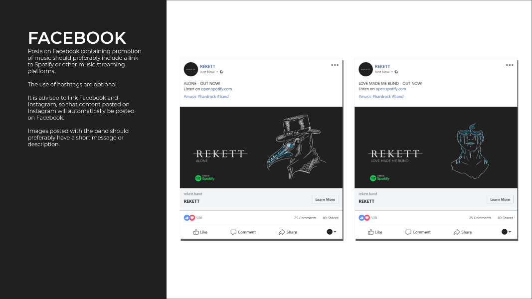
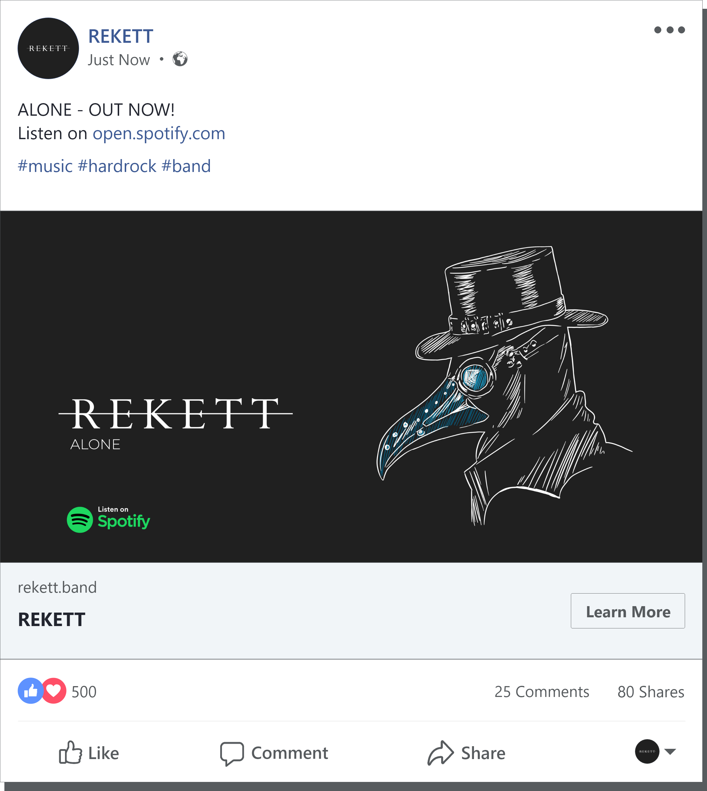
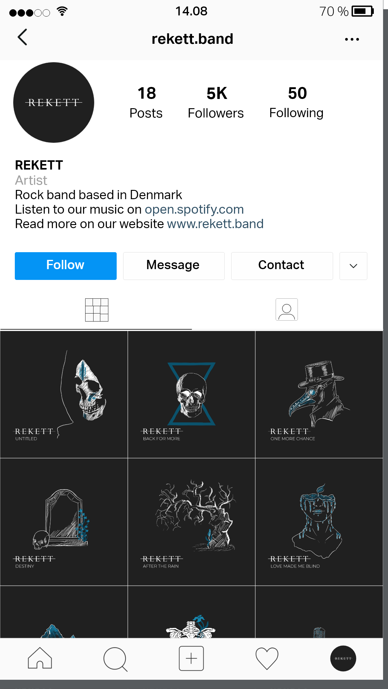
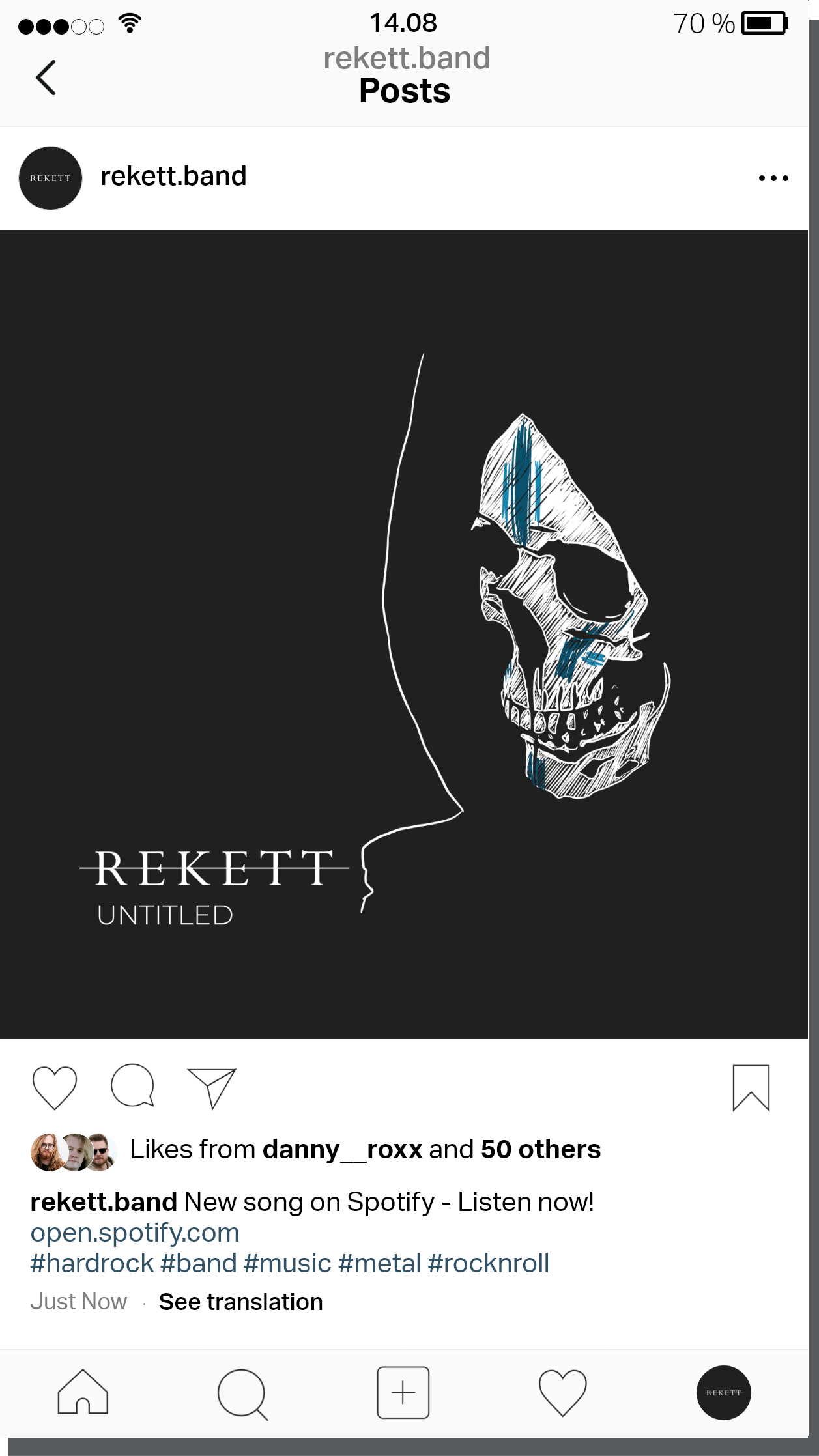
Subsequent to the definition of the visual identity, several examples of social media posts were created for both Facebook and Instagram.
Evolution
Much of the evolution phase of the project was spent on making improvements to the website, in an attempt to ensure the best possible interaction experience.
Result
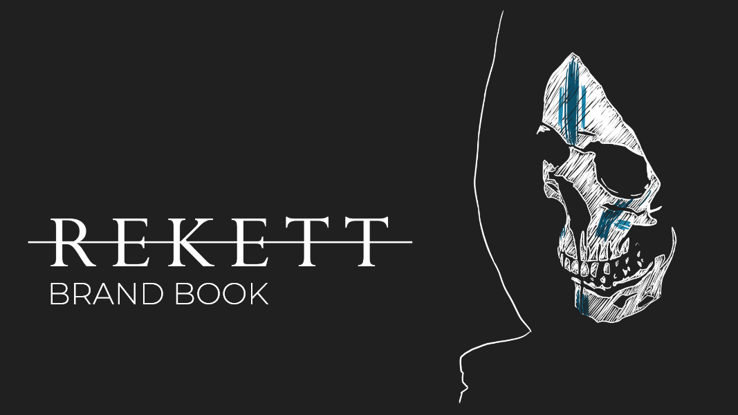
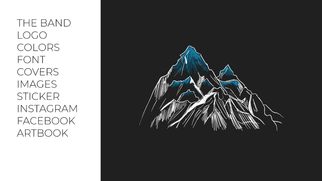
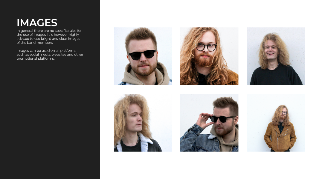
This project concluded in the creation of a brand book, to collect all products created during the process. This was used both as a design guide for the use of logo, colors, social media etc., and at the same time functioned as a catalog of the bands visual identity.
